
An enquiry arrives from your website. What happens next?
Check the whole journey from the form to an employee’s reply, not just the success message.
Read storyOpen the page on a phone and try to do what visitors actually came for.
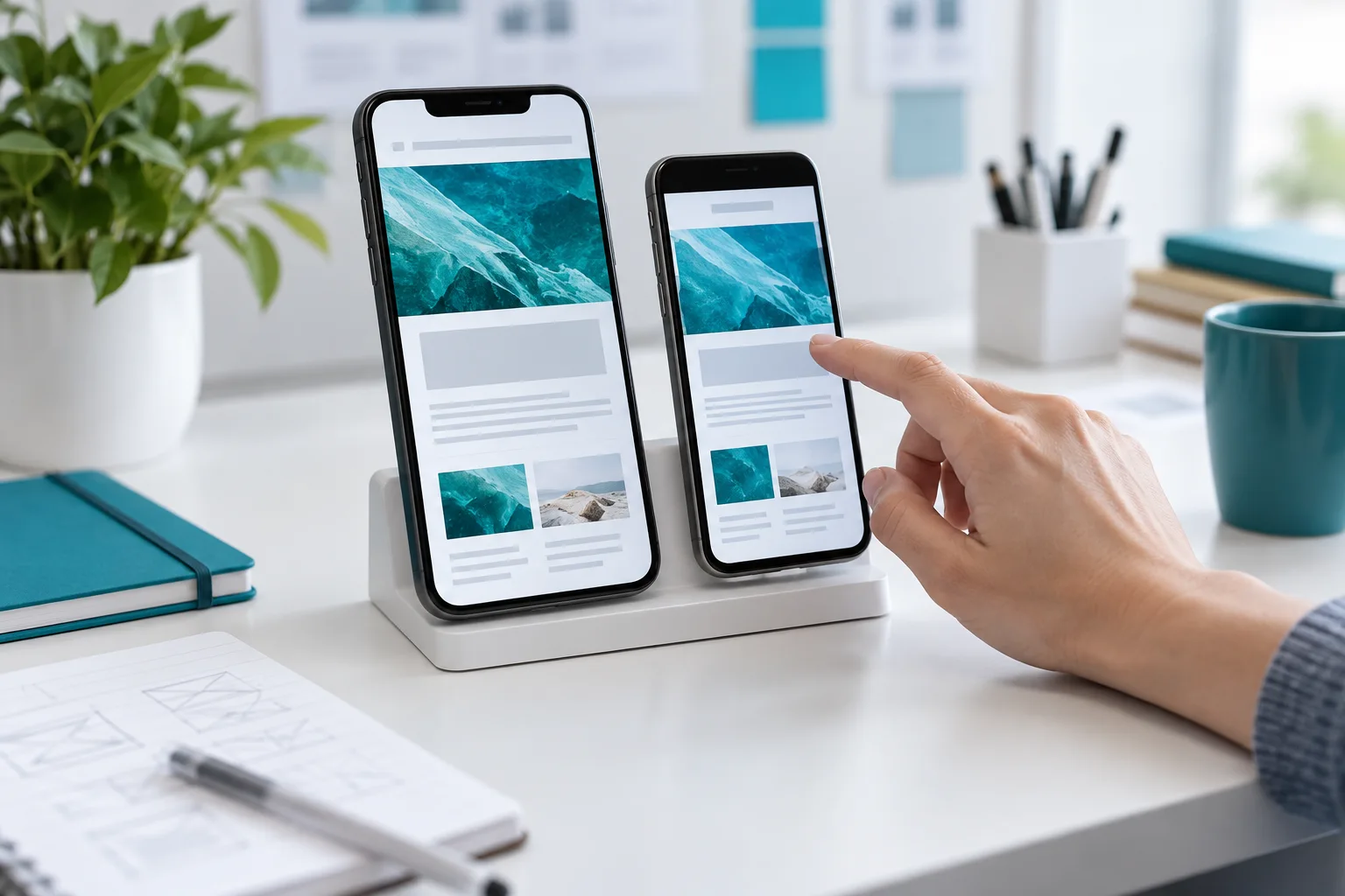
A tidy screenshot does not prove a mobile website is easy to use. Problems often appear after the first tap: the keyboard covers a field, a long headline moves a button, or a form error fails to explain what needs fixing.
Choose an action: finding delivery terms, reading an article or sending an enquiry. Complete it on an ordinary phone without tips from the developer. Note where you must pause, zoom or go back. Check both portrait and landscape orientations.
Use real long names and text. In a multilingual project, open each locale separately: equivalent buttons can take up different amounts of space. Do not judge the design only by the shortest sample in the mockup.
Submit a form with a required field missing, then correct it. Entered data should not disappear after a normal validation error. Each field needs a clear, persistent label, and the message should explain what to do. The W3C WAI guide covers the basics of labelling controls.
Increase text size and open the page over a slower connection. Check whether a fixed panel obscures an important paragraph or button. In your final list, include the observation and steps to reproduce it, not just “uncomfortable to use.” This makes it possible to fix the specific cause and repeat the same check afterwards.
Continue the topic and work through the next step.
Check the whole journey from the form to an employee’s reply, not just the success message.
Read story
Access, instructions and an update process help your team manage the site after launch.
Read story
Start with the audience, purpose and materials. Discuss colours and reference websites afterwards.
Read story