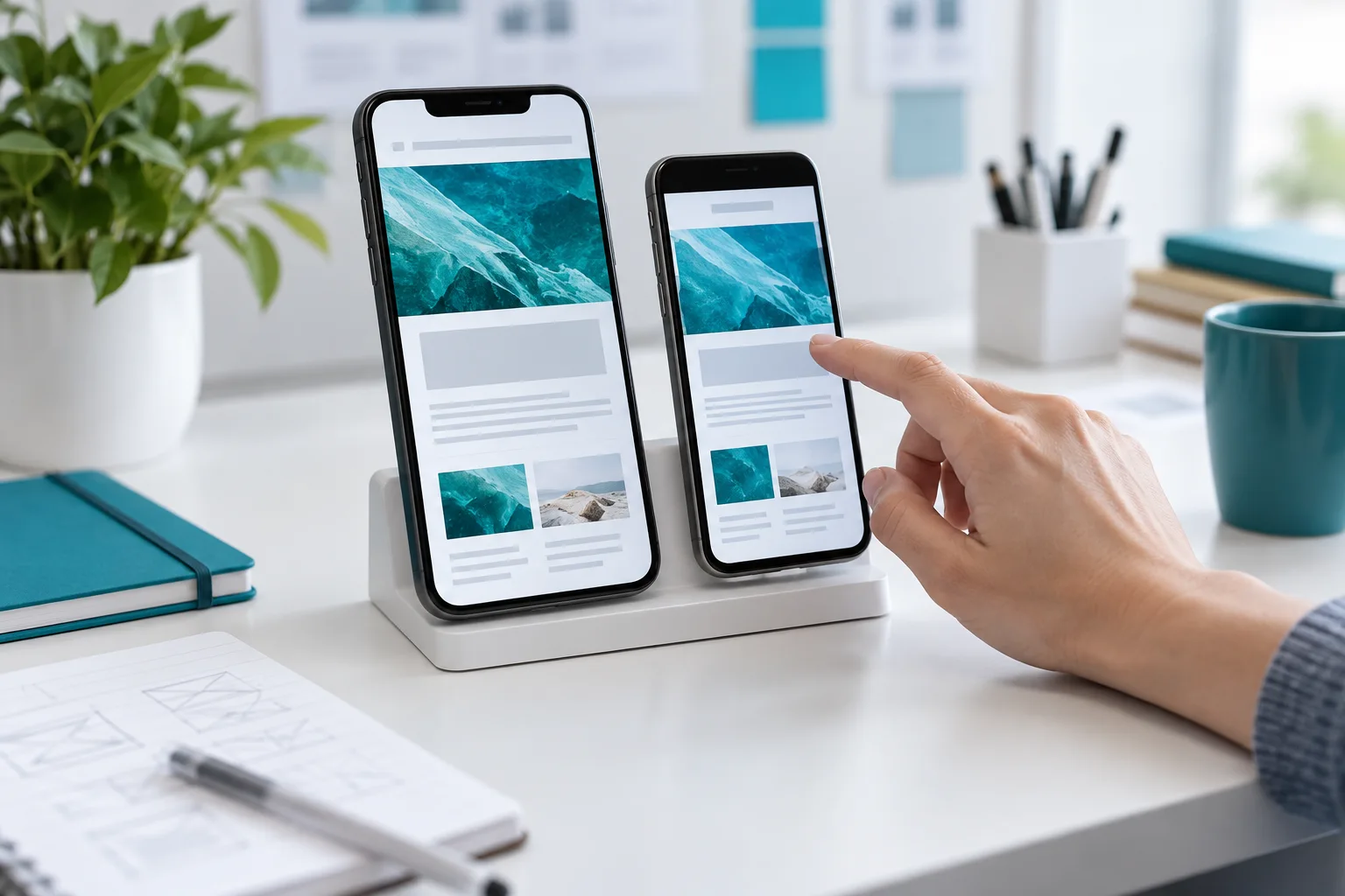
Checking a mobile website through a real task
Open the page on a phone and try to do what visitors actually came for.
Read storyClear labels, useful errors, keyboard access and a real confirmation matter more than a decorative button animation.
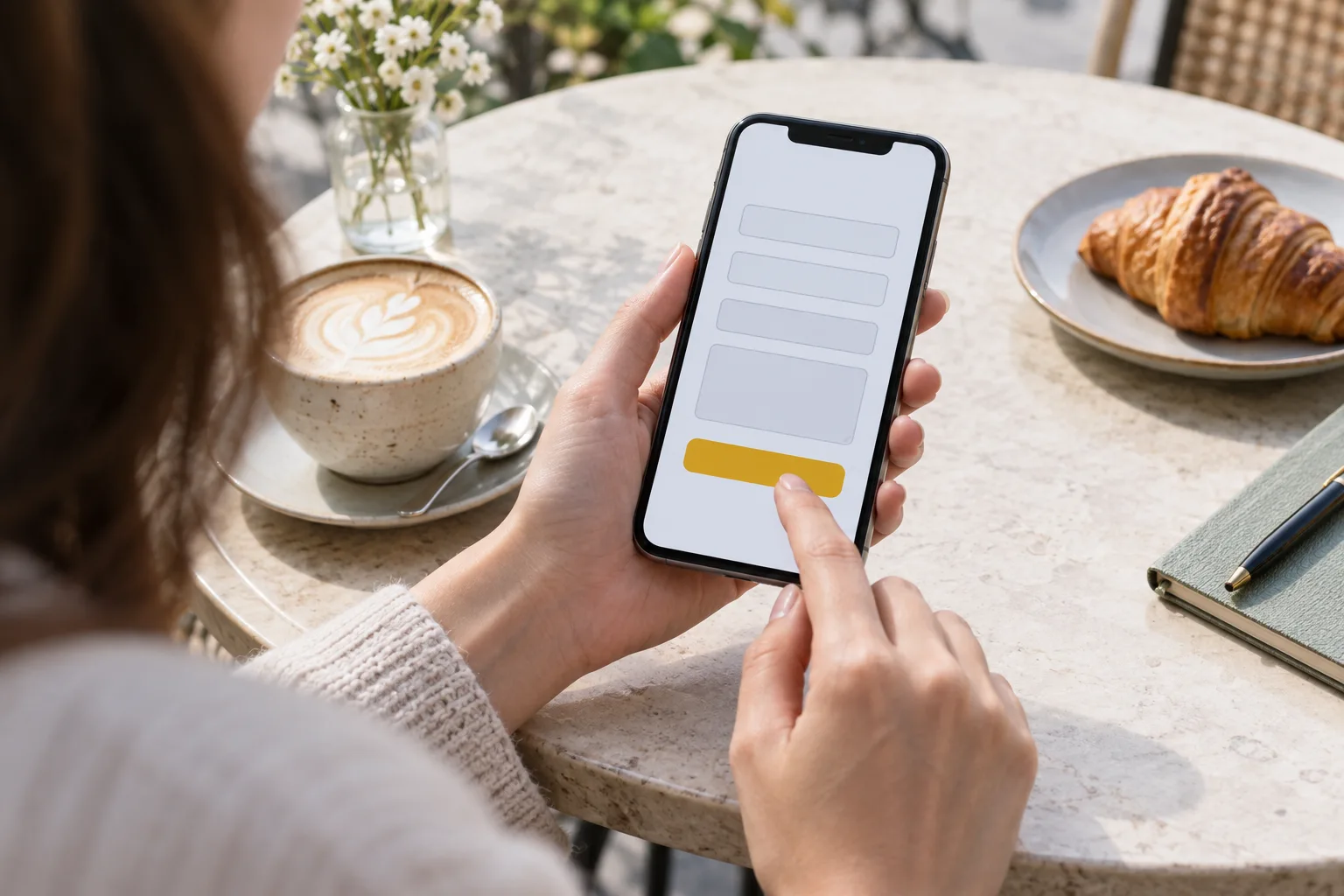
A tidy form can still leave visitors guessing. A phone format may be unclear, a label may disappear or submission may produce no visible response. Review the full journey, including what happens to the enquiry after it leaves the page.
Write down why the team needs each detail at this stage. If you can ask for it during a later conversation, reconsider making it mandatory now. A first contact should not become a questionnaire for potentially useful data.
For a regional audience, check whether the form unnecessarily imposes a single name or telephone format. If you serve only certain countries, explain that before the visitor starts.
W3C recommends associating controls with labels that describe their purpose. Avoid using a placeholder as the only cue: it disappears during entry. W3C guidance on form labels.
Complete the form with a keyboard. The focus order should follow the reading order and the active control should remain visible. Repeat the exercise on a phone to check whether the keyboard covers instructions or the submit button.
“Error 400” does not explain the next step. Identify the field that needs attention and describe the correction. If the connection fails, retain the entered text and offer a retry.
Try an empty submission, a mistyped address, a long name and a repeated button press. These are useful scenarios, not a substitute for a complete accessibility assessment.
Explain that the request was received and what follows. Promise a response time only if the team can meet it. Submit a test message and check its arrival with the recipient.
Finally, ask someone unfamiliar with the design to enquire without help. Watch where they hesitate. For the wider context, read our first-website planning guide.
Continue the topic and work through the next step.
Open the page on a phone and try to do what visitors actually came for.
Read story
Connect each comment to the visitor’s task and distinguish required fixes from personal preferences.
Read story